Customer wanted: A beautifully designed, feminine yet modern presentation that reflects her identity.
Customer provided: A rough 10-slide Canva deck with color inspirations, a few photos, and a request to make it feel like Velvet.
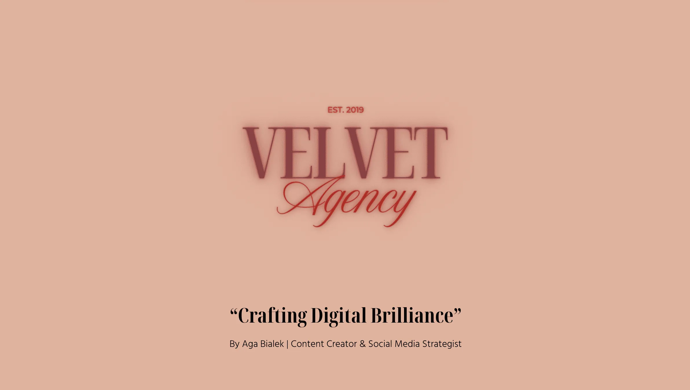
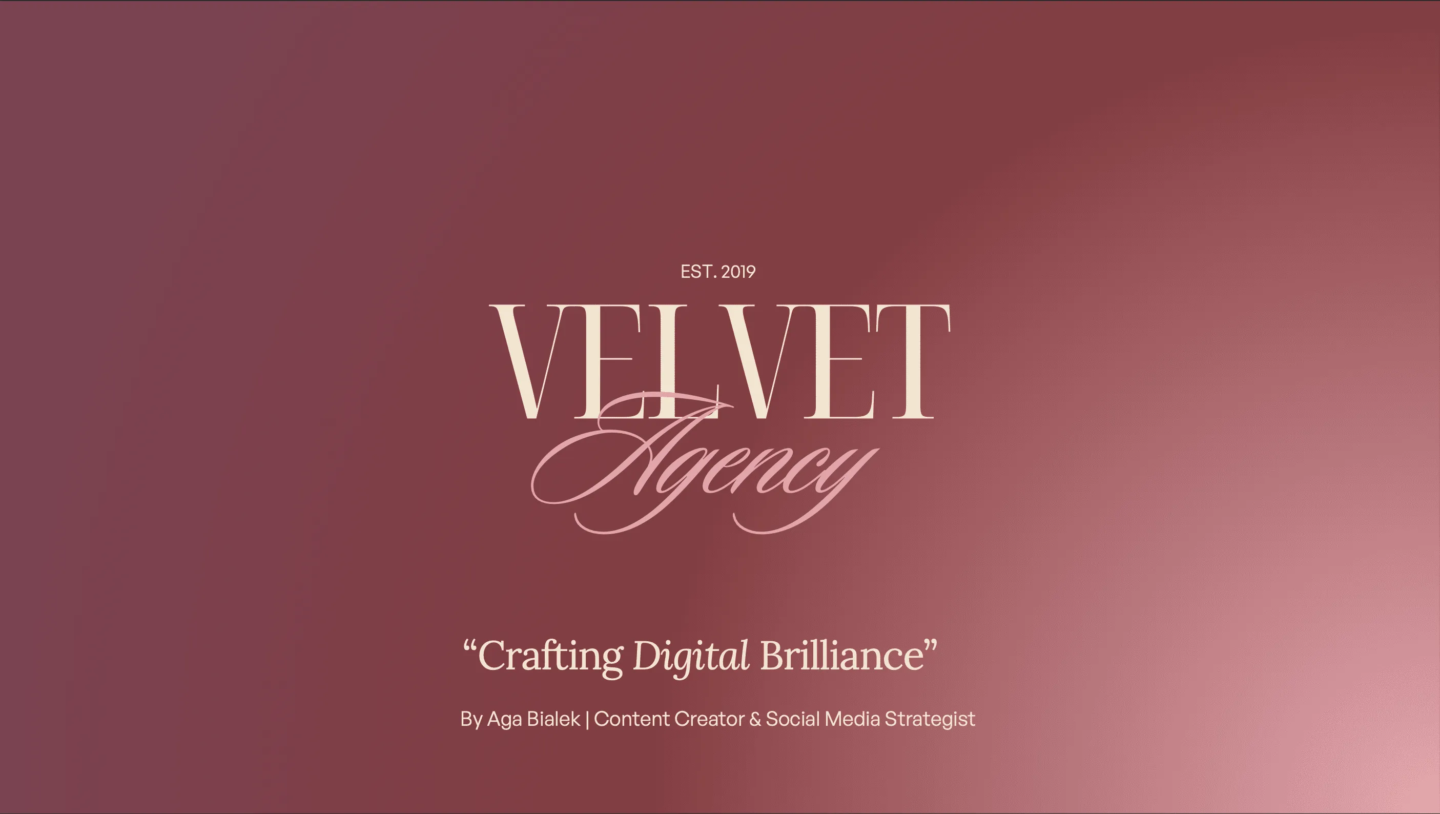
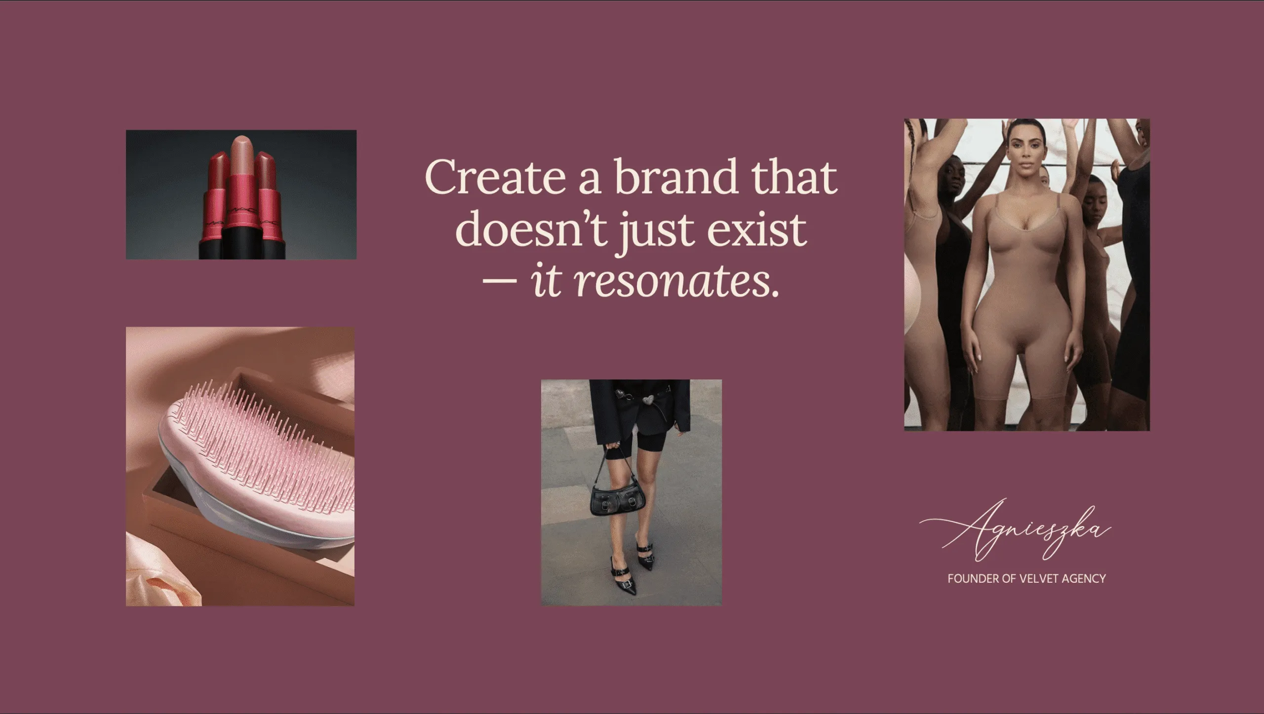
Velvet Agency is the personal brand of a content creator and freelancer with a strong eye for aesthetics and strategy. Her work lives at the intersection of beauty and business, and she needed a presentation that communicated both without leaning too corporate or too cliche. While the agency name hinted at softness and luxury, Agnieszka's actual brand voice was sharp, considered, and highly visual. Our task was to blend those elements into one cohesive deck.
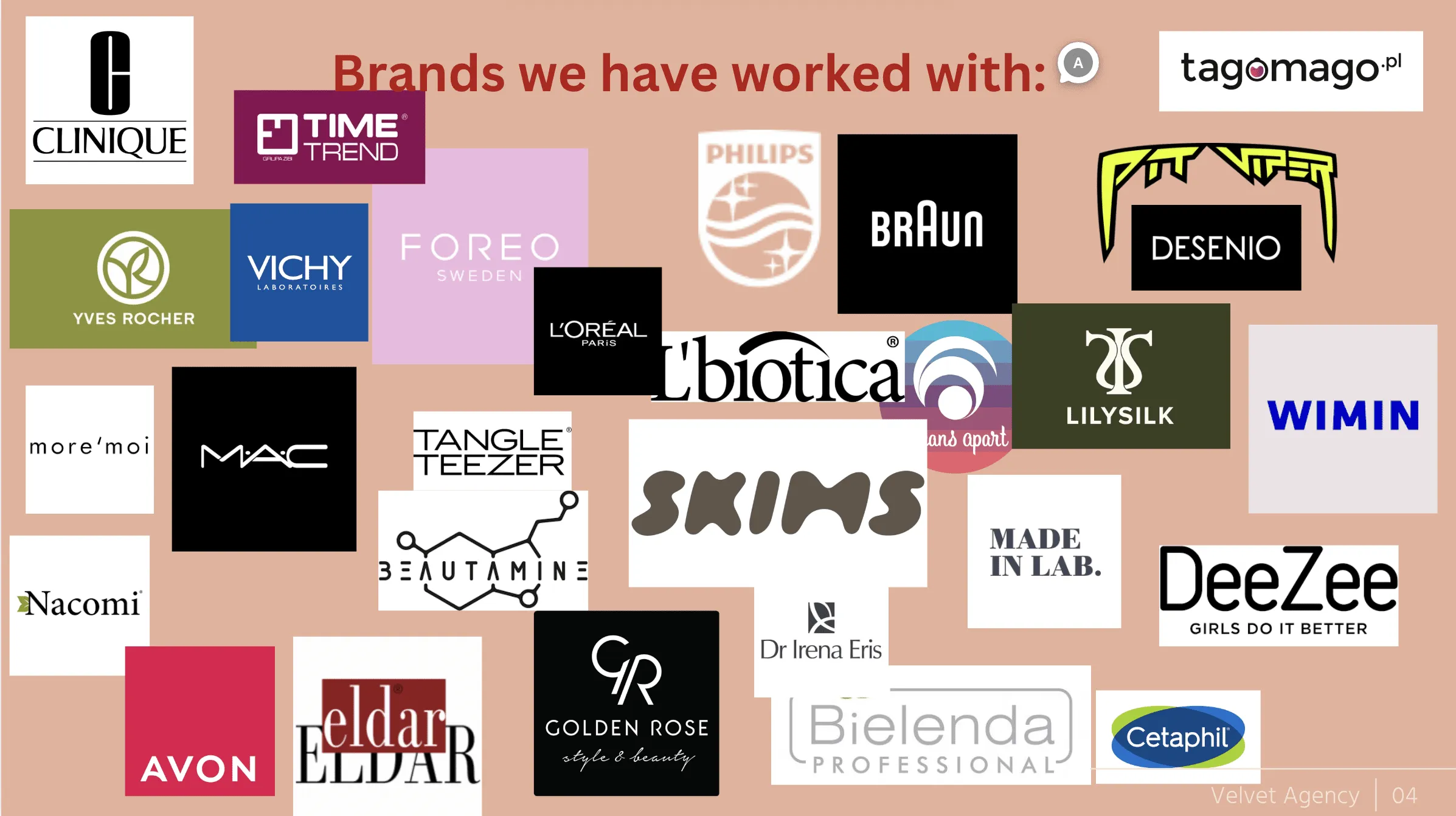
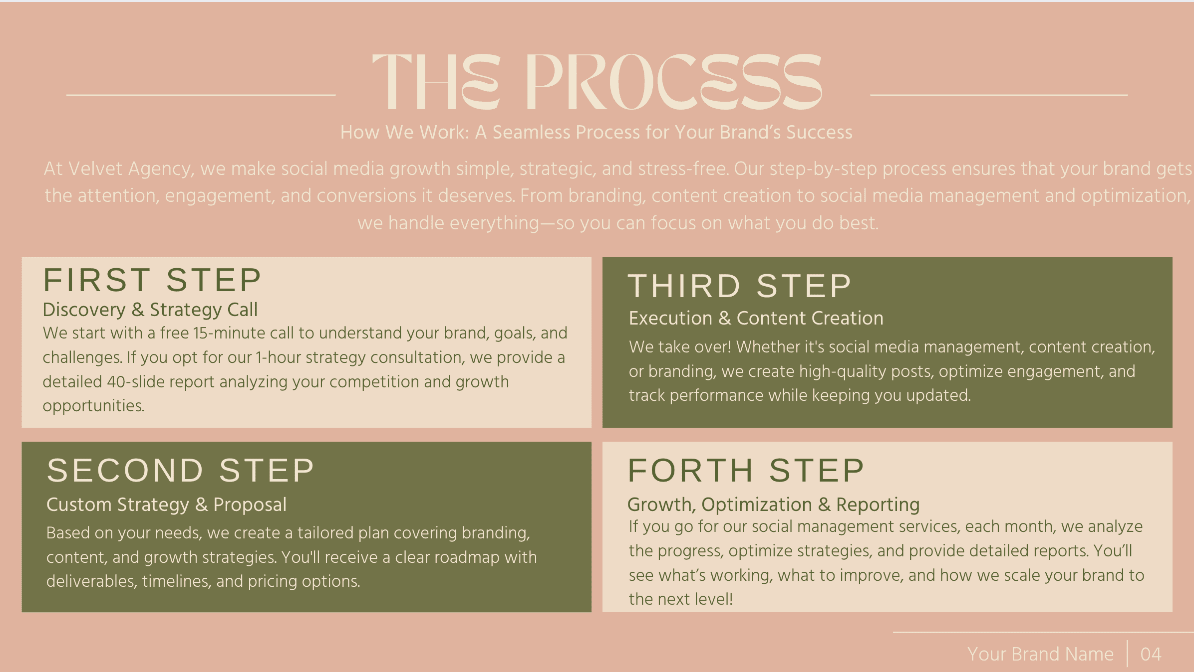
The existing deck felt a bit too neutral, with lots of beige, black, and white. It also lacked the memorable presence our client was after. Our client wanted to stand out from the crowd while still appealing to both women and men. The final product had to look premium, feel approachable, and present her as both a solo creative and, when needed, a full agency.
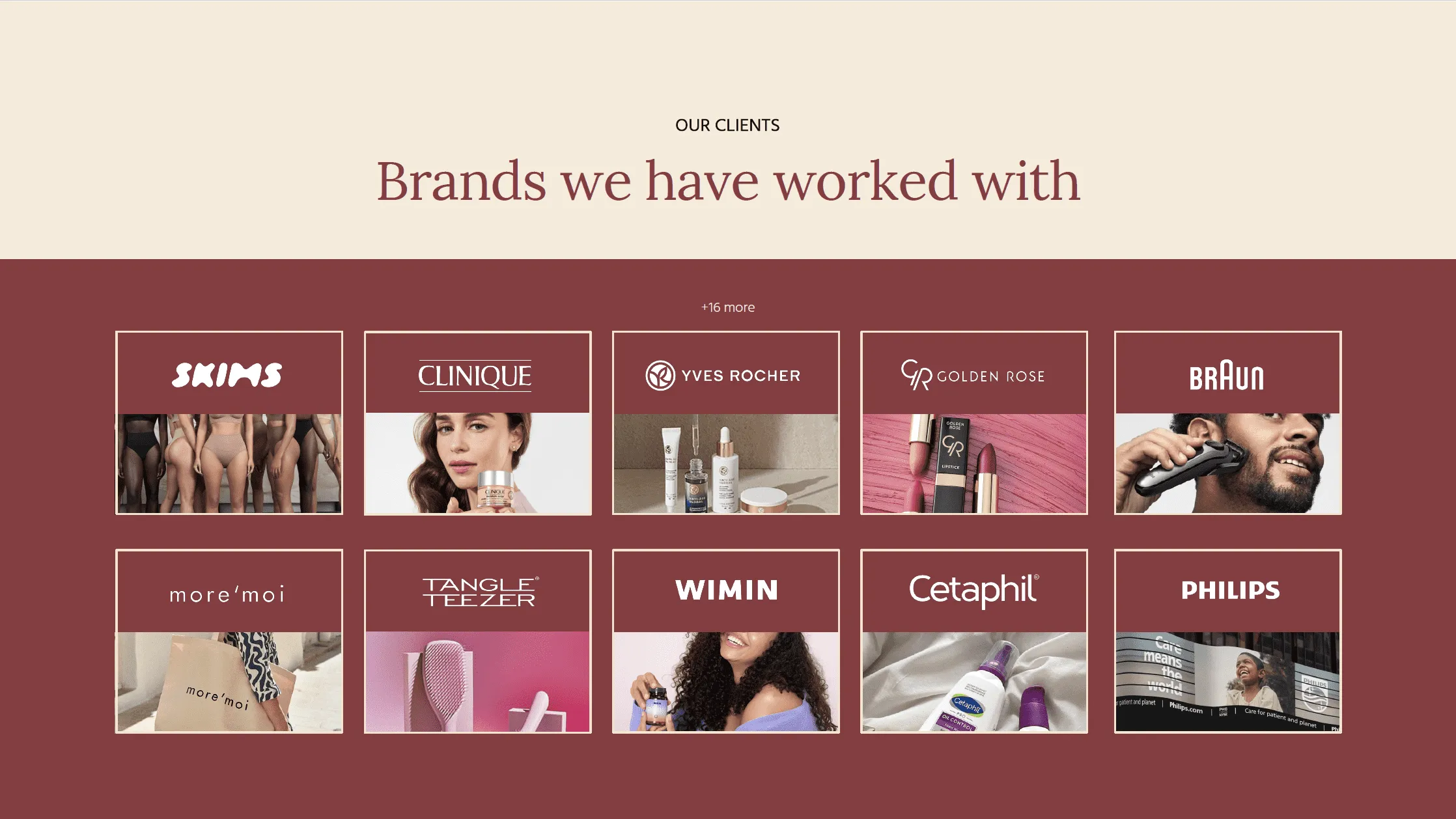
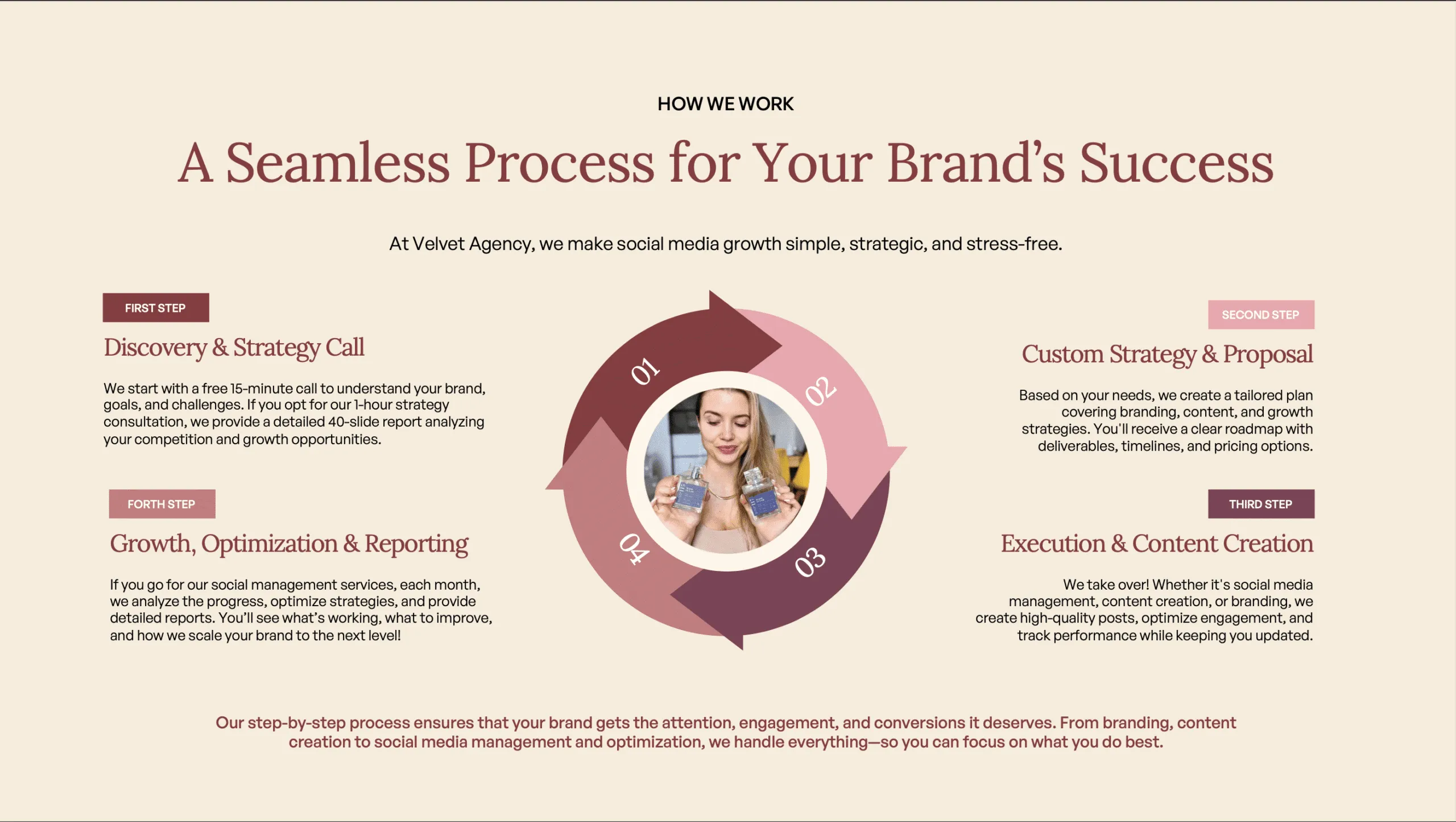
We reimagined the deck from the ground up using a custom palette of blush pink, wine red, olive green, and warm beige, colors that evoke elegance, creativity, and contrast. We built two versions of the cover slide (personal and agency-focused), updated the layout hierarchy for flow and readability, and added subtle design flourishes inspired by velvet texture and editorial fashion. A cut-out version of her portrait added personality while staying clean and professional. The final deck was delivered in both Canva and PowerPoint formats for full flexibility.
A presentation that feels like an extension of her personal style: sophisticated, modern, and intentionally designed. Each slide works hard to build trust and visual impact, making it easy for Agnieszka to pitch new clients or present past work. The color palette and type combinations leave a lasting impression, and most importantly, it feels like her.
Agnieszka was thrilled to finally see a visual identity that truly reflected her brand's essence: elevated, personal, and unforgettable. The bold-yet-feminine color palette, combined with clean, flexible layouts, gave her a professional presence without losing authenticity. She especially appreciated how the final deck struck the perfect balance between her two roles as a solo creative and as Velvet Agency. All while looking exactly like something she'd want to hire.


.jpg)