There’s a familiar moment every presenter faces: staring at a slide in progress, cursor blinking, asking yourself the eternal design question: Should I just use bullet points here, or is this the perfect place for an infographics? It’s not a trivial decision. One approach says “efficient.” The other says “visual.” One guides the eye linearly; the other paints a picture all at once. Both are legitimate tools. And both, when used poorly, can just as easily turn an audience off as they can draw them in.
The tension between bullet points and infographics is really a tension between clarity and impact, between structure and imagination. And when you’re crafting a pitch deck, a presentation for stakeholders, or even an internal update for your team, the decision carries weight. It can shape whether your key message lands with a thud or lingers with resonance. So how do you decide? When should you rely on the straightforward rhythm of bullet points—and when is it time to unleash the power of visuals?
Let’s explore this balancing act, not with hard rules or design commandments, but with a deeper understanding of what these tools are actually doing to your audience’s brain…and how to make them work with you instead of against you.
The psychology behind how we process slides
Before we dig into when to use which tool, it helps to understand why this choice matters at all. Because whether you realize it or not, every slide is a small cognitive experience for the viewer. And our brains are deeply sensitive to how information is structured.
Bullet points serve the logical part of the brain. They create sequence, rhythm, and hierarchy. When done well, they help your audience process a lot of information quickly by laying it out in digestible chunks. But they come with a catch. If overused or packed too tightl, they become visual fatigue. The eye scans mechanically, the mind zones out, and the message gets lost in monotony.
Infographics, on the other hand, speak to the brain's visual-spatial center. They don’t just tell; they show. Relationships between data points, proportions, timelines, hierarchies: these come to life in ways that no text ever could. A good infographic is like a mural that delivers insight in an instant. But if misused or overdesigned, it can overwhelm, confuse, or distract from the core message.
So, the question isn’t really “which is better?” The question is “which better serves the message at this moment in your story?”
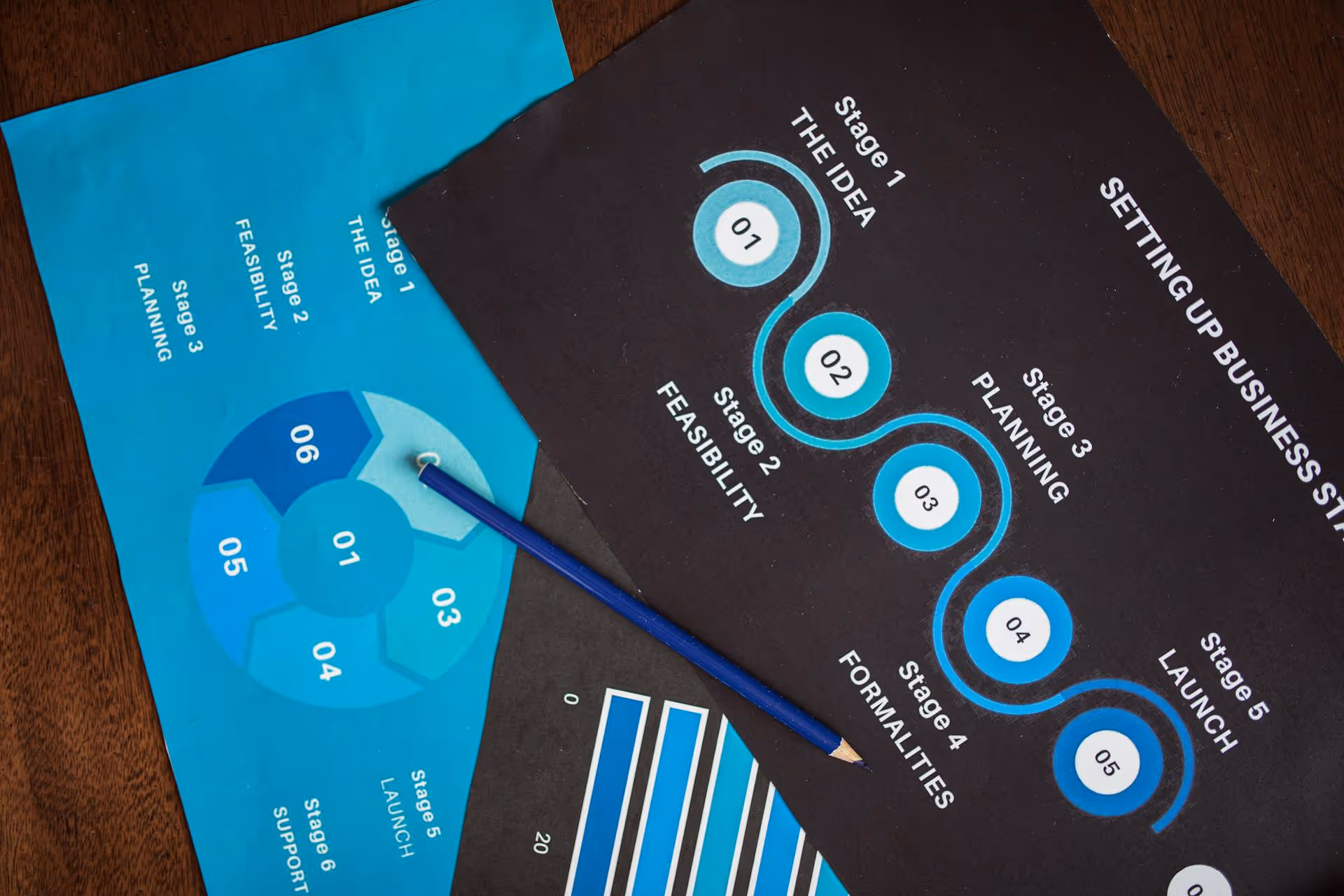
Infographics vs bullet points. Bullet points are underrated when used sparingly
Bullet points often get a bad rap, usually because people treat them like containers for every thought that didn’t fit anywhere else. But when used deliberately, they are among the most efficient tools in your presentation arsenal.
There are moments when what you need is linear thinking. When you're laying out steps in a process, presenting options, summarizing takeaways, or reinforcing conclusions, bullet points can create clarity. Their minimalist structure gives breathing room to ideas. They guide the audience through your logic without distraction. This is especially valuable in live presentations, where verbal explanation complements brief on-screen cues.
But moderation is key. Bullet points should not be a dumping ground. If your slide reads like a script, you’ve gone too far. The goal is to support your spoken word, not compete with it. Ideally, a bullet point slide should act like scaffolding: holding up your argument just enough to let your ideas take shape in the audience’s mind.
And don’t forget about rhythm. Bullet points are not meant to appear on every slide. Think of them as pauses between visuals, giving your audience a chance to recalibrate. In the context of a pitch deck, they can be particularly effective in sections like your business model, revenue streams, or go-to-market strategy: places where clean, structured thinking is what you want to emphasize.
Infographics: when words aren’t enough
If bullet points are for logic, infographics are for insight. They work best when your message involves relationships, comparisons, flows, or big-picture thinking. That is: when the viewer needs to see not just what something is, but how it connects to something else.
A well-designed infographic can show market share at a glance, or how your user journey flows from awareness to conversion. It can demonstrate how your product compares to competitors, or how your costs break down across categories. Infographics are particularly powerful when you’re working with data - not because they make numbers “prettier,” but because they turn abstract values into visual stories.
That said, infographics are not decoration. They need to be purposeful. Overly complex or generic ones can actually cloud your message. Simplicity is what gives infographics their power. They should answer one specific question clearly, not try to summarize your entire business in one swirling diagram.
In a pitch deck, infographics shine in places like market opportunity, user demographics, timelines, traction milestones, and funnels. They let investors grasp the size of the opportunity - or the velocity of your growth—without wading through text. But like any good metaphor, their effectiveness depends on what they’re grounded in.
The art of alternating and knowing your audience
The most effective slide decks don’t choose between bullet points and infographics. They alternate between them strategically. This alternation creates rhythm and contrast. Visual slides wake the audience up; structured slides give them mental rest. One excites, the other reassures.
But the ratio depends heavily on your audience. If you're speaking to data-driven investors, your infographic better be grounded in real numbers. If you're speaking to a boardroom full of analysts, bullet points might make more sense. If you're pitching to creatives or product teams, more expressive visuals might build rapport faster.
Consider also the context of delivery. In-person presentations allow you to explain complex visuals out loud, so infographics can be more abstract. But for decks that are read independently - like those emailed ahead of time, bullet points might carry more weight, as they preserve clarity without needing narration.
Ultimately, presentation design is about emotional pacing. You’re not just informing; you’re guiding attention, shaping perception, building momentum. Bullet points are control. Infographics are energy. Great slides harness both.
Closing thoughts: less a choice, more a conversation
In the end, choosing between bullet points and infographics is less about design technique and more about storytelling literacy. What does your audience need to understand right now? What part of your idea needs to come alive visually? What part needs calm, structural support?
It’s tempting to fall in love with one tool or the other. But the best presenters stay flexible. They listen to their content. They treat each slide as a scene in a larger narrative. One that shifts in tone, tempo, and texture. One slide might whisper in neat, sharp lines. The next might roar in vibrant, data-driven color. It’s not the format that matters. It’s the intention behind it.
So the next time you stare at that blinking cursor, don’t ask yourself which looks cooler. Ask which speaks more truthfully to the moment. Because whether you're clicking bullets into place or sketching out a flowchart, your slides are not just about information. They're about connection. And that, in the end, is what great presentations are built to do.
Written by:
Tags:
Pitch deck design
Presentation Design
You May Also Like
Real Estate Pitch Deck
Investor Pitch Deck
July 23, 2026
Real Estate Documents: What They Are, Why They Matter, and How Better Design Helps You Sell the Vision
Real estate documents do more than close deals, they set the first impression. See what they include, why they matter, and how stronger design helps you sell the vision, not just the property.
Investor Pitch Deck
Startup Pitch Deck
AI Pitch Decks Are Everywhere. But Investors Still Want Human Judgment.
AI can generate a polished pitch deck in minutes, but investors are judging the strategic thinking behind it, not just the slides. Here's why human judgment remains the real differentiator in fundraising.
Investor Pitch Deck
Startup Pitch Deck
Master Template: The System That Works for the Entire Team
A master template turns scattered, off brand decks into one consistent presentation system giving sales, marketing, product, and leadership a shared foundation they can actually use.
Contact us
Thank you! Your submission has been received!
Oops! Something went wrong while submitting the form.


.png)
.png)


